Making a Better Responsive Table Using Vanilla CSS Only for Better User-Experience

Designing Coder is about programming and digital art, here you will get articles about useful little code snippets, digital art done through code and much more.
Usually the table we make does not provide good user experience in terms of data visualisation. So in this article I am going to share my approach for making a better responsive table for data-visualisation.
If you want to skip reading then you can watch YouTube video on it. The link is at the end of the article.
Step 1: Setting up table content in html.
Instead of using traditional HTML tags, I am going to use similar class names. No special reasons just personal preference.
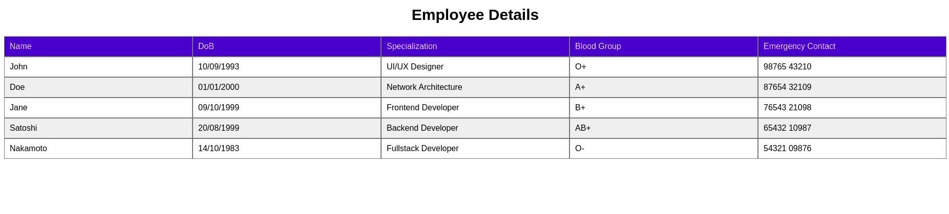
Let's consider a dummy data in which we have details for printing a company's employee Id-card.
    <div class="caption">Employee Details</div>
    <div class="table">
      <div class="th">
          <div class="td">Name</div>
          <div class="td">DoB</div>
          <div class="td">Specialization</div>
          <div class="td">Blood Group</div>
          <div class="td">Emergency Contact</div>
      </div>
      <div class="tbody">
        <div class="tr">
          <div class="td">John</div>
          <div class="td">10/09/1993</div>
          <div class="td">UI/UX Designer</div>
          <div class="td">O+</div>
          <div class="td">98765 43210</div>
        </div>
        <div class="tr">
          <div class="td">Doe</div>
          <div class="td">01/01/2000</div>
          <div class="td">Network Architecture</div>
          <div class="td">A+</div>
          <div class="td">87654 32109</div>
        </div>
        <div class="tr">
          <div class="td">Jane</div>
          <div class="td">09/10/1999</div>
          <div class="td">Frontend Developer</div>
          <div class="td">B+</div>
          <div class="td">76543 21098</div>
        </div>
        <div class="tr">
          <div class="td">Satoshi</div>
          <div class="td">20/08/1999</div>
          <div class="td">Backend Developer</div>
          <div class="td">AB+</div>
          <div class="td">65432 10987</div>
        </div>
        <div class="tr">
          <div class="td">Nakamoto</div>
          <div class="td">14/10/1983</div>
          <div class="td">Fullstack Developer</div>
          <div class="td">O-</div>
          <div class="td">54321 09876</div>
        </div>
      </div>
    </div>
Step 2: Styling the classes for a table look
Let's have a zebra stripe table and assign different color to the header and also assign equal width to each column.
    body {
      font-family: arial;
    }
    .caption {
      font-size: 30px;
      font-weight: bold;
      margin: 25px;
      text-align: center;
    }
    .tr {
      display: flex;
    }
    .th {
      display: flex;
      background: mediumblue;
      color: white;
    }
    .td {
      width: 20%;
      border: 1px solid #777;
      padding: 10px;
    }
    .tr:nth-of-type(even) {
      background: #efefef;
    }
Now we have a basic table. You can resize your screen and see how bad is the user experience for small screens.
Let's make it look better for small screens also.
Step 3: Hiding Header and Changing Table View
We will change to single column and multi row view for each data set. From here we will write styling for @media (max-width: 600px), (max-device-width: 600px).
    .th {
        display: none;
    }
    .tr {
        display: block;
        margin-bottom: 25px;
        background: transparent !important;
    }
    .td {
        background: #f0f0f0;
        display: flex;
        width: 90%;
        margin: auto;
    }
Step 4: Adding header and data labels
We will consider the first row of each set as the header and color it different for better visualisation.
      .td:nth-of-type(1) {
        content: "Name:";
        background: mediumblue;
        color: white;
        font-weight: bold;
      }
      .td:before {
        font-weight: bold;
        display: block;
        width: 50%;
      }
      .td:nth-of-type(2):before {
        content: "DoB:";
      }
      .td:nth-of-type(3):before {
        content: "Specialization:";
      }
      .td:nth-of-type(4):before {
        content: "Blood Group:";
      }
      .td:nth-of-type(5):before {
        content: "Emergency Contact:";
      }
Step 5: Fixing font-size and padding for all devices.
    @media (max-device-width: 600px) {
      .table {
        font-size: 2rem;
      }
      .td {
        padding: 20px;
      }
    }
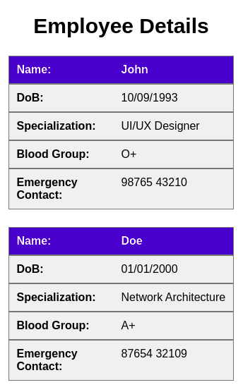
Finally, we can change the screen size and still our data is easy to understand.
Please feel free to drop your opinion or any helpful tips.
Feel free to connect on Social Media . _


